Consent Banner Design Variables and Opt-In Rate Lift
Design choices, not luck, determine whether consent rates soar to 80% or sink below 10%.
Consent banner opt-in rates swing from under 10% to over 80% depending entirely on how a banner is built. That spread isn't noise. It maps onto a defined set of design choices, and understanding which ones move the needle (and which ones cross into illegal territory) separates data teams collecting real signal from teams collecting garbage dressed up as consent.
The global average is somewhere between 42% and 47%, but that number hides more than it reveals. Two sites with identical products, identical traffic volume, and identical legal obligations can land at opposite ends of the range purely because of banner design. Back in 2018 and 2019, acceptance rates ran as high as 60% to 90%, mostly because reject options barely existed. By 2024 and 2025, once regulators forced a genuine choice onto the screen, half to two-thirds of users started rejecting instead, and Usercentrics' benchmark data shows rejection climbing another 8 percentage points year over year since 2023.
Users also aren't reading these things anymore. Cookiebot's UX research clocked average banner interaction time at 3.2 seconds in 2021; by 2025 it had dropped to 1.4 seconds. Copy isn't doing the persuading anymore. Design is.
A high acceptance rate isn't automatically a win. A rate inflated through dark patterns produces consent that's legally void, since manufactured consent doesn't reflect real user behavior the way genuine consent does. Consented users convert at multiples of non-consented users. Volume without quality is a liability wearing a KPI's clothes.
The baseline a site inherits before a single design choice is made
Geography sets the floor before a single pixel gets designed. EU users reject at 45% to 55% overall, with the DACH countries (Germany, Austria, Switzerland) landing at the high end, 50% to 55%. Nordic countries run a bit lower, 40% to 45%. The UK, post-Brexit, tracks closer to US behavior at 30% to 38%, and US users sit lowest among these regions at 25% to 35%.
That means a 40% acceptance rate reads completely differently depending on who's showing up. On a site with heavy German traffic, 40% might be a strong result. On a site full of visitors from a country with typically high acceptance rates, that same 40% signals something's wrong with the banner. Any site with a global audience is blending these extremes into one misleading average, so segmenting consent data by country isn't optional if the goal is an honest read on banner performance.
Industry benchmarks (per 2024 to 2025 data from Kukie.io) tell a similar story. Healthcare sites see 60% to 67% acceptance, largely because the value exchange is obvious: appointment reminders, personalized content, things people actually want. Finance and insurance run 55% to 62%, propped up by institutional trust among existing customers. General eCommerce is 45% to 55%, shifting up or down depending on how many visitors are logged-in repeat customers versus first-timers. B2B and SaaS are 40% to 50%, populated by purpose-driven, tech-savvy visitors who aren't hostile but aren't easy marks either. News and media drop to 30% to 40%, complicated further by cookie walls and pay-or-consent setups. Ad-supported media is lowest among the segments named here, 23% to 30%, the residue of years of aggressive tracking eroding trust even on free content. Real estate and energy sites round out the bottom tier, driven by one-time visitors with no ongoing brand relationship to lean on.
Traffic source adds another layer. Direct traffic and email referrals convert to consent at higher rates because the brand relationship already exists. Google organic traffic does well too, since intent-driven visitors are focused on completing a task and less inclined to fight over a banner. DuckDuckGo organic is the opposite story: a self-selected, privacy-conscious user base that rejects far more often, and on individual sites the gap between DuckDuckGo and Google referral consent rates can exceed 36 percentage points. Paid ads bring moderate, mixed-intent traffic, often first-time visitors. Social referrals land moderate too, casual browsing with low commitment either way.
The takeaway: benchmark against a site's own traffic mix, not an industry average pulled from a report. An aggregate consent rate is just a weighted blend of very different populations, and treating it as a single number to optimize is how teams end up chasing the wrong variable.
The compliance floor that every design variable must clear
Article 5(3) of the ePrivacy Directive requires prior consent before non-essential cookies get placed. GDPR layers on top of that: consent has to be freely given, specific, informed, and unambiguous. Those aren't suggestions.
Most sites aren't there yet. A CHI study covering 254,148 websites across 31 countries found only 15% of cookie banners met minimum GDPR requirements. Just 67% showed any consent interface at all, and among the banners that failed compliance, 56% lacked a reject option entirely. That's not a rounding error, that's most of the internet running consent flows that wouldn't survive a regulatory audit.
Progress is happening, just slowly. Sites offering equally visible accept and reject buttons rose from 2.94% in 2018 to 30.66% in 2024. The share of banners with equal-prominence buttons climbed from 27% in 2023 to 52% in 2025. Regulators have also sharpened their focus. Sweden's IMY, in April 2025, called out contrasting colors that make "accept" pop while "reject" fades into the background, along with multi-step rejection flows and privacy controls buried where nobody looks. Austria's highest court ruled in 2025 that a colored "Accept" button paired with a gray "Reject" link violates GDPR outright. Enforcement activity around cookie consent has intensified notably in 2025, with regulators issuing significant actions across multiple jurisdictions.
And the tracking problem doesn't stop at button color. Pre-consent tracking, meaning cookies set before a user makes any choice at all, has been documented on substantial shares of both EU and US sites in recent research. Fake opt-outs, where cookies keep firing after someone clicks "Reject," appeared on roughly one in four sites globally.
Doing this properly doesn't tank acceptance the way people fear, contrary to what site owners tend to assume. A well-built, compliant banner costs roughly 10 to 15 percentage points of acceptance compared to one that hides the reject option. That's a real cost, but it's nowhere near catastrophic, and it's the price of consent data anyone can actually trust. Every design lever discussed from here on operates inside these legal boundaries. Push outside them, and the resulting numbers are worthless no matter how good they look on a dashboard.
Banner placement and format: how position and screen footprint move interaction rates
Position on the page changes interaction rates more than most teams expect. Across EU websites, 64.6% place their banner at the bottom of the screen, 27.2% at the top, and 7.8% in the middle, and bottom placement is by far the most common choice in that same dataset.
A field experiment by Utz and colleagues, run across 82,890 German e-commerce users, found bottom-left placement drew by far the most engagement, 37.1% of visitors interacted with it regardless of device. Small bars placed at the top drew only 2.9% interaction. Bottom bars overall pulled 9.6%. Users were substantially more likely to engage with a banner sitting in the lower-left corner than with a bar stretched across the top or bottom of the page. The bottom-left advantage may reflect region-specific user habits rather than a universal pattern, and should not be assumed to transfer across all audiences.
Format matters just as much as position. Center modals push opt-in rates to 70% or 90% when built well, since they force a decision before any page interaction happens, though they need a clearly visible reject option to stay compliant and carry real risk of higher bounce rates if executed badly. Bottom bars run lower, 50% to 70%, and generate less frustration since they're less intrusive, though on mobile, usability constraints can make it harder to give all buttons equal prominence. Corner slide-ins are widely regarded as striking a strong balance between conversion and compliance: they don't block content in the way modals do. Available comparisons suggest center modals tend to outperform bottom bars by a meaningful margin for the same audience and copy, though exact figures vary by source.
Mobile deserves its own note. Mobile and desktop consent rates run surprisingly close in benchmark data, so the real mobile risk isn't a conversion gap, it's usability. A banner that makes someone scroll to find the reject button creates usability problems and raises compliance concerns, not just annoyed users. Progressive disclosure, meaning essential choices on the first screen and detail one tap deeper, handles small screens without leaning on dark patterns to do it.
Button design and visual hierarchy: the most litigated variable in consent UX
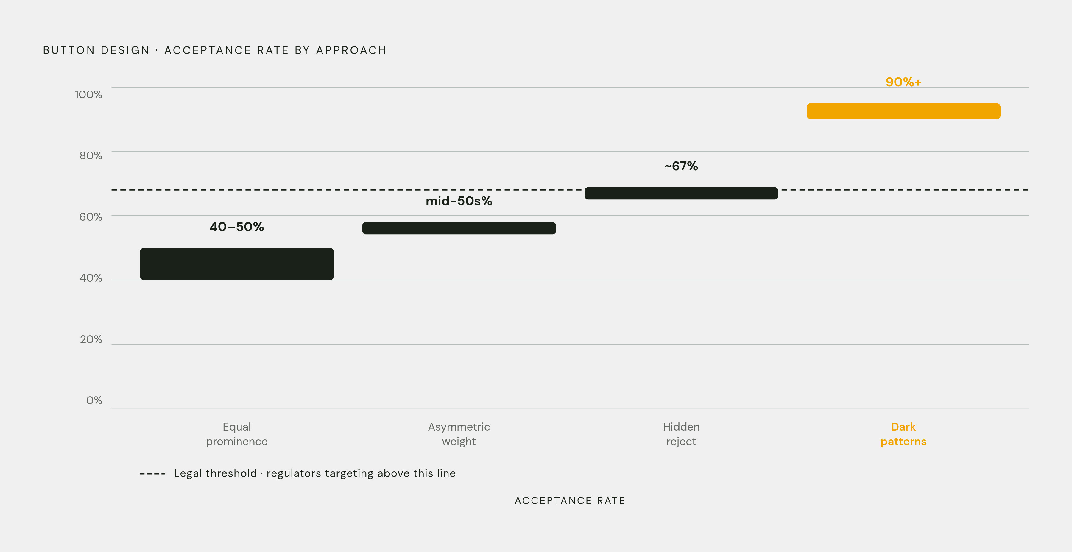
Nothing on the banner moves numbers like the buttons. Hiding the reject button entirely raises acceptance by roughly 22 percentage points, according to a CHI 2020 field experiment. When rejecting requires multiple clicks instead of one, up to 90% of users give up and accept instead, not because they changed their mind, but because the path of least resistance wins.
Run the numbers across designs and a pattern becomes visible. Equal-prominence buttons land a compliant site around 40% to 50% acceptance. Asymmetric design, meaning visual weight favors "Accept" without technically hiding "Reject," can push that into the mid-50s. Full dark patterns push acceptance above 90%, and that last jump is exactly the illegal zone regulators are now targeting by name.
Sweden's IMY and Austria's 2025 court ruling both zeroed in on specifics: filled, colored "Accept" buttons paired with gray or outlined "Reject" buttons (which Austria's court ruled a GDPR violation outright), one-click acceptance paired with multi-click rejection, and privacy controls buried in secondary menus with no visibility on the first screen.
There's a safe zone here, and it's narrower than a lot of teams assume but wider than the panic suggests. A filled "Accept" paired with an outlined "Reject" is generally fine, as long as both buttons are the same size and meet WCAG contrast standards. Enforcement from CNIL and the EDPB has consistently targeted cases where rejecting takes extra clicks or is genuinely harder to find, not minor color differences between two buttons of equal size and prominence.
Platform choice matters more than most site owners realize. Cookiebot-powered banners carry a reject button 55.16% of the time; generic plugin banners manage it only 13.39% of the time. The consent management platform a site picks is itself a design variable, quietly setting defaults that shape outcomes before anyone touches a color picker. And compliance on paper doesn't always mean compliance in spirit: a 2025 study found 38% of banners that technically include a reject button still make "Accept" the dominant visual focal point, which is legal but sitting squarely on the regulatory watchlist.
Copy length and framing: what users process in 1.4 seconds
At 1.4 seconds of average interaction time, most users aren't reading banner copy at all. Design is doing the talking before any word gets processed.
Longer, more detailed copy actually decreases acceptance, and not for the reason people assume. It's not that users read the fine print and get spooked. Longer text raises the odds someone ignores the banner altogether and either bounces or clicks whatever's easiest to escape the screen. Reading level matters too: banners written at roughly a high school level see meaningfully better engagement than banners loaded with legal or technical jargon. Oversimplify too far, though, and vagueness starts to read as evasive, which raises suspicion instead of easing it.
Emotional language turns out to be a weak lever. Phrases like "We respect your privacy" move acceptance only marginally compared to neutral wording, so appeals to warmth aren't where the real gains live.
Specificity is where the real gains live. A line like "Cookies help us remember your preferences and show you relevant products; your data stays with us, we don't sell it" consistently outperforms a generic list like "We use cookies for analytics and marketing." Users grant consent when they understand what they're actually getting and trust who's asking, and neither of those comes from boilerplate legal language copied out of a template. Practically, that means copy work should focus almost entirely on the headline and the button labels, since those are the only words most visitors will ever actually read.
Granular controls versus binary choice: what the research says and where it diverges
Granularity sounds like the more respectful option. Give users category-level control over analytics, advertising, and functional cookies, and in theory they feel more in control. The research complicates that story.
Nouwens and colleagues found that putting granular category controls on the first screen decreases overall consent by roughly 8 to 20 percentage points. Only about 2% to 3% of users ever bother selecting specific categories when given the choice up front, so most of that complexity does nothing but add friction for the vast majority of visitors who just want to make a decision and move on.
Layering the choice differently changes the outcome. Offering category-level controls as a second screen, one step deeper, lets users accept some cookies without facing an all-or-nothing decision, and that structure typically raises overall consent by roughly 10 to 15 percentage points compared to a pure binary banner with no middle ground at all.
The contradiction resolves once it's clear this is an architecture question, not a feature question. First screen: a clear Accept and Reject, equal size, equal visual weight. One click deeper: granular controls for the small fraction of users who actually want them. Never acceptable: burying settings, forcing a multi-page flow, or requiring users to interact with individual categories before they're even allowed to make a basic choice. That structure satisfies GDPR's specificity requirement, since granularity is available to anyone who wants it, without turning complexity into a weapon against the people who just want to decline.
Brand alignment, trust signals, and audience-matched design
A banner's opt-in rate reflects how much a visitor trusts it, not just how the buttons are arranged. Visual alignment with brand identity and a clear explanation of what consenting actually gets the user sit right alongside button design as primary levers, not afterthoughts.
Two approaches hold up under testing. A brand-forward banner uses the site's primary action color, the same one used on "Add to Cart" or "Sign Up," on the "Accept All" button, with a secondary brand color filling the banner background. This performs best with returning visitors, newsletter subscribers, and loyalty members, audiences who already trust the brand and respond to that visual continuity. A minimalist banner leans on brand-derived neutral tones and minimal copy, and converts better with tech-savvy users, heavy browser-extension users, and privacy-focused visitors who've learned to distrust anything that looks visually aggressive.
Traffic source should shape design too. A visitor arriving from a branded email has already shown a degree of trust, so a generic, off-brand banner breaks that continuity and hurts acceptance. A cold visitor from organic search, on the other hand, can experience a highly branded, urgency-driven banner as pressure rather than familiarity, since there's no existing relationship to justify the tone. A Consentmanager case study found that matching banner design to visitor context through targeted A/B testing produced roughly a 15% uplift in consent rates.
Trust signals carry real weight too, not as decoration but as risk reducers: security seals, a visible link to the privacy policy, and a plain statement that data isn't being sold. And repeated banner prompts trigger the "reject all" reflex regardless of content. "Reject all" has become muscle memory for a huge share of users, so a banner that reads as generic, pushy, or manipulative triggers that reflex regardless of how technically compliant the underlying flow actually is.
How to A/B test banner design legally and what variables to prioritize
Testing banner design is legitimate and worth doing, but the test itself has to stay inside the same compliance boundaries as the banner it's evaluating. That means every variant in a test needs an equally prominent reject option, no variant can rely on pre-consent tracking to measure results, and no variant can obscure or delay the reject path just to see what happens to the numbers.
Priority order matters here, and it isn't arbitrary. Button design and visual hierarchy come first, since that's the variable with the largest documented swing and the one regulators are watching most closely. Placement and format come next: bottom-left versus center-modal versus corner slide-in, tested against the site's actual traffic mix rather than a generic playbook. Copy comes third, and testing should stay narrow, focused on headline and button label wording rather than expanding body text, since expanded text rarely helps and often hurts. Granular-control architecture comes fourth: testing whether a second-layer category screen lifts consent without dragging down the first-screen decision rate.
Segmentation has to run through all of it, producing results broken down by geography rather than averaged across users who don't exist. A test that blends German traffic with US traffic, or email referrals with cold organic search, produces a result that describes an average user who doesn't exist. Results need to be read by geography, industry context, and traffic source before any design conclusion gets drawn, otherwise a winning variant in one segment can quietly be a loser in another, canceled out in the topline number.
None of this is about finding the version that produces the highest number. It's about finding the version that produces the highest number of honest yeses, from users who understood the exchange and chose it. That's the only kind of consent that holds up, legally and analytically both.